Internet
Fonts You Should Avoid as a Web Designer
Most important aspect of your website is the font that you choose. The right font can make your website stand out in a positive way and the wrong font choice can really hinder the way.

Creating your own website might sound like this fun, creative adventure, but there are so many things that go into it that you might not even realize. All of these factors add up to make your website one of the most important and influential portions of your business or message.
Perhaps the most important aspect of your website is the font that you choose. The right font can make your website stand out in a positive way and grab the attention of visitors like no other. The wrong font choice can really hinder the way that your website comes across and hurt your image in the eyes of your potential visitors.
To really make sure that you get the best out of your website, it is important to make sure that you choose the right font, but it is also imperative that you avoid the wrong font as well. But what fonts, in particular, should you avoid? Here are just a few of the ones that you definitely want to keep away from.
Table of Contents
1. TheSans
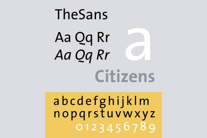
This might seem like something of a surprise since it is pretty delicate in its style as well as evenly spaced. After all, those are two of the traits that you look for when you are looking for the perfect font for any kind of short copy or online content.
Unfortunately, it is ruined by a few overly stylish letters that make it seem like they are not from even the same font. While you might want to add something stylish to your website, it has to fit and make sense. Unlike a bebas font download that works in so many places, this one can feel outdated quickly. Unfortunately, it does not make sense here, and you definitely want to avoid that inconsistency.
2. Trajan
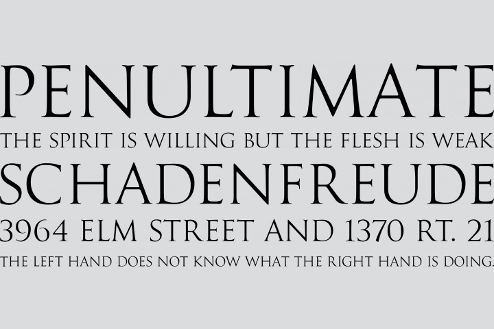
This has become one of the most overused fonts, especially when it comes to film posters, as well as other movie materials aimed toward marketing. From the major market films all the way down to the indies, marketers have used this font to try to establish a bit of dynamic authenticity and has worn out its welcome fairly quickly.
What also makes it a bit worn out is that it is in almost every edition of Adobe Creative Suite. It is certainly great for smaller touches and maybe the occasional title, but it can get overused way too quickly and needs to take a break.
3. Comic Sans
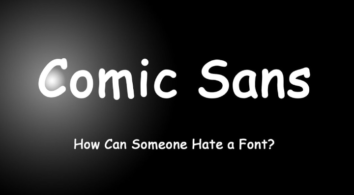
This is possibly the most reviled font type that there is today. Sure, it’s kind of whimsical, and that certainly has its place when properly used. But the thing is, this is one of the most commonly used fonts in the business world. They use it for far too many things and really misuse it in this way.
That isn’t to say that it doesn’t have its place. For children’s products, comic books, and party invitations, the childish, whimsical font certainly fits. But the corporate world needs to get the message that it just does not fit in with the buttoned-up tone that this world carries.
Maybe a bit of time away from the spotlight would serve this font well. Then again, maybe it’s time to retire it for good.
4. Franklin Gothic
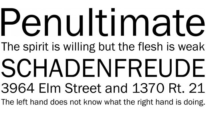
Welcome to the most overused font there is if you want to make your website look like a newspaper. Franklin Gothic is iconic and definitely has the capability to look good, but amateur designers out there go for the classic look that is becoming way too common and misused far too often.
Maybe use it for something like headlines, shorter leading questions, and minor elements of the design. But to those using it for their entire website? Don’t. Just don’t. You will become part of the over cliché group that continues to use this font for everything when it should be used sparsely.
Because of its classic touch and appeal, it certainly won’t go anywhere anytime soon. Help keep this font as a fresh and viable choice by not using it in the worst places possible. Also, consider using it in a way that is complementary instead of primary, and you will find yourself getting an extended life out of Franklin Gothic.
These are just a few of the fonts that you, as a new web designer, want to avoid for cliché sake. Implement them in a complementary way, but avoid using them as your primary font if you don’t want to find yourself feeling cliché and outdated.
Helpful Resources:
1. Which OS is Best For Gaming in [2019]
2. 7 Irresistible Gadgets You Should Try [2019]
3. 5 Game Of Thrones Mobile Version Apps Every Gamer Need To Download
4. The Most Common Problems Of Windows 10 And Troubleshooting
5. 16 Best (free) AMP – (Accelerated Mobile Pages) WordPress Plugins in [2019]
6. 16 Best Free SEO WordPress plugins for your Blogs & websites in [2019]
-
 Instagram4 years ago
Buy IG likes and buy organic Instagram followers: where to buy them and how?
-

 Instagram4 years ago
100% Genuine Instagram Followers & Likes with Guaranteed Tool
-
 Business5 years ago
7 Must Have Digital Marketing Tools For Your Small Businesses
-
 Instagram4 years ago
Instagram Followers And Likes – Online Social Media Platform


